
tokyo:ocean is a fictitious but highly plausible arts venue based in a former shoe factory in Hoxton, East London. It operates on a ‘shared space’ basis with its studios and galleries available for exhibitions and performances by up and coming artists, designers and performers, in addition to a fully licensed cafe-bar and restaurant.
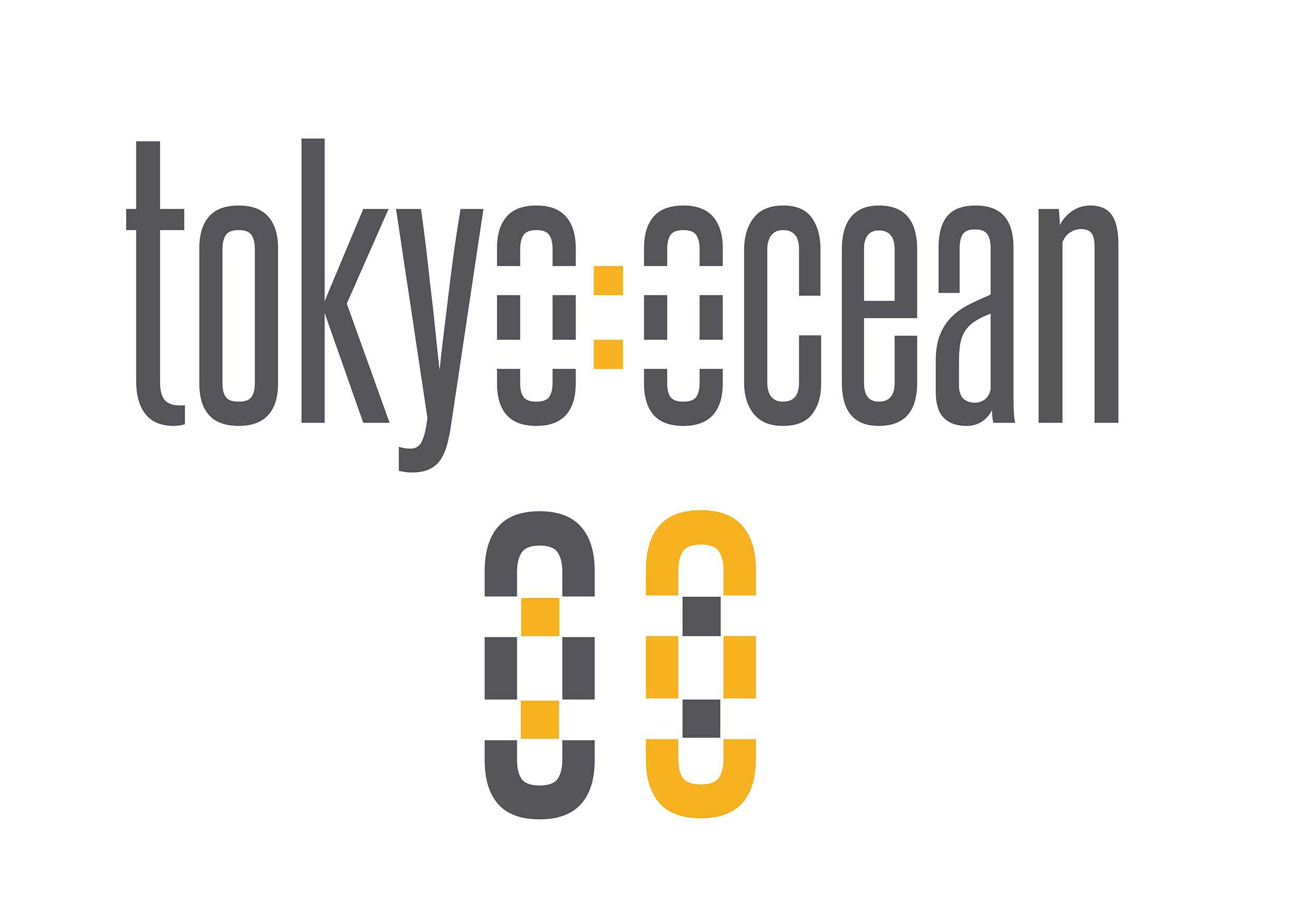
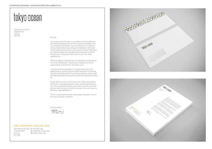
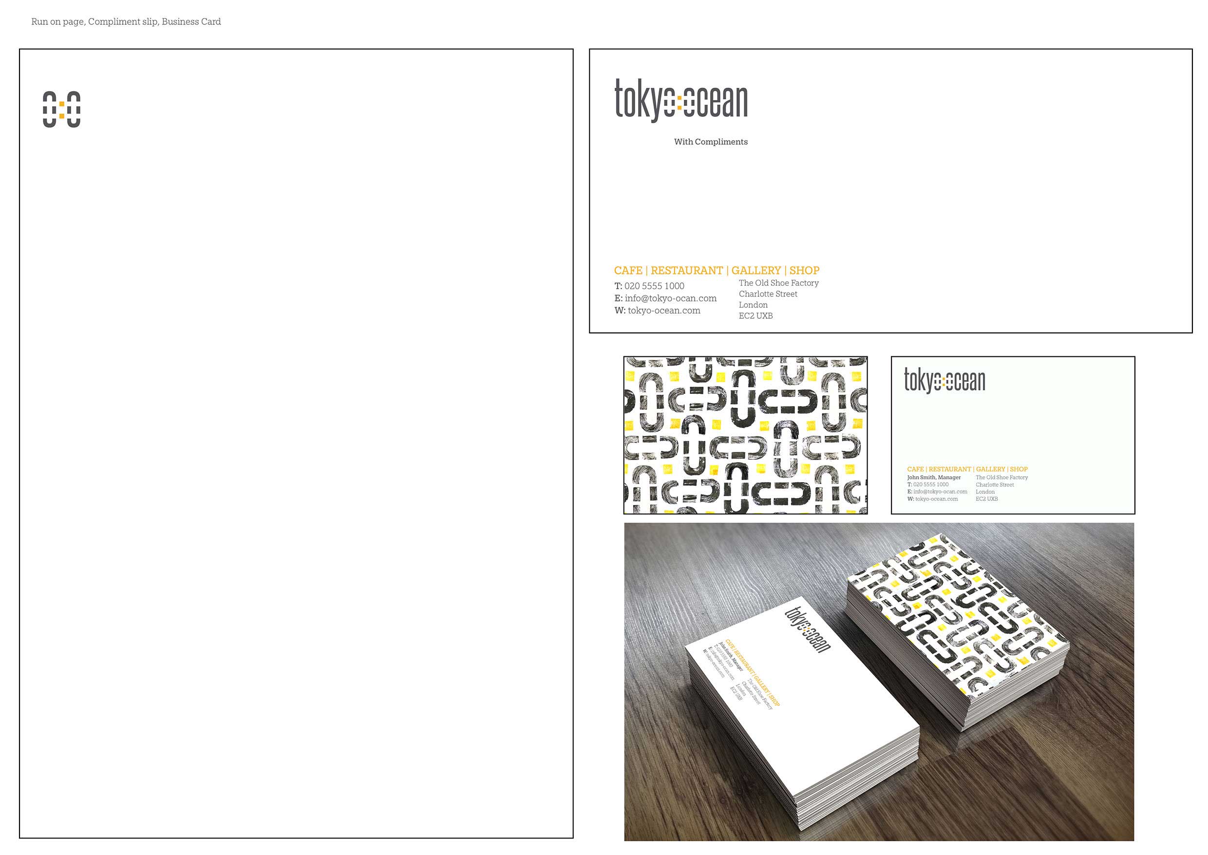
I started off by creating a logo and favicon, from here I made a pattern using stamps made from an eraser, which added a authentic texture, ensuring it didn’t look too clinical. My brand guidelines stated that the logo/company details on the stationary appeared on the top left hand side – all other information could be placed on the right hand side (as demonstrated on the letter design)
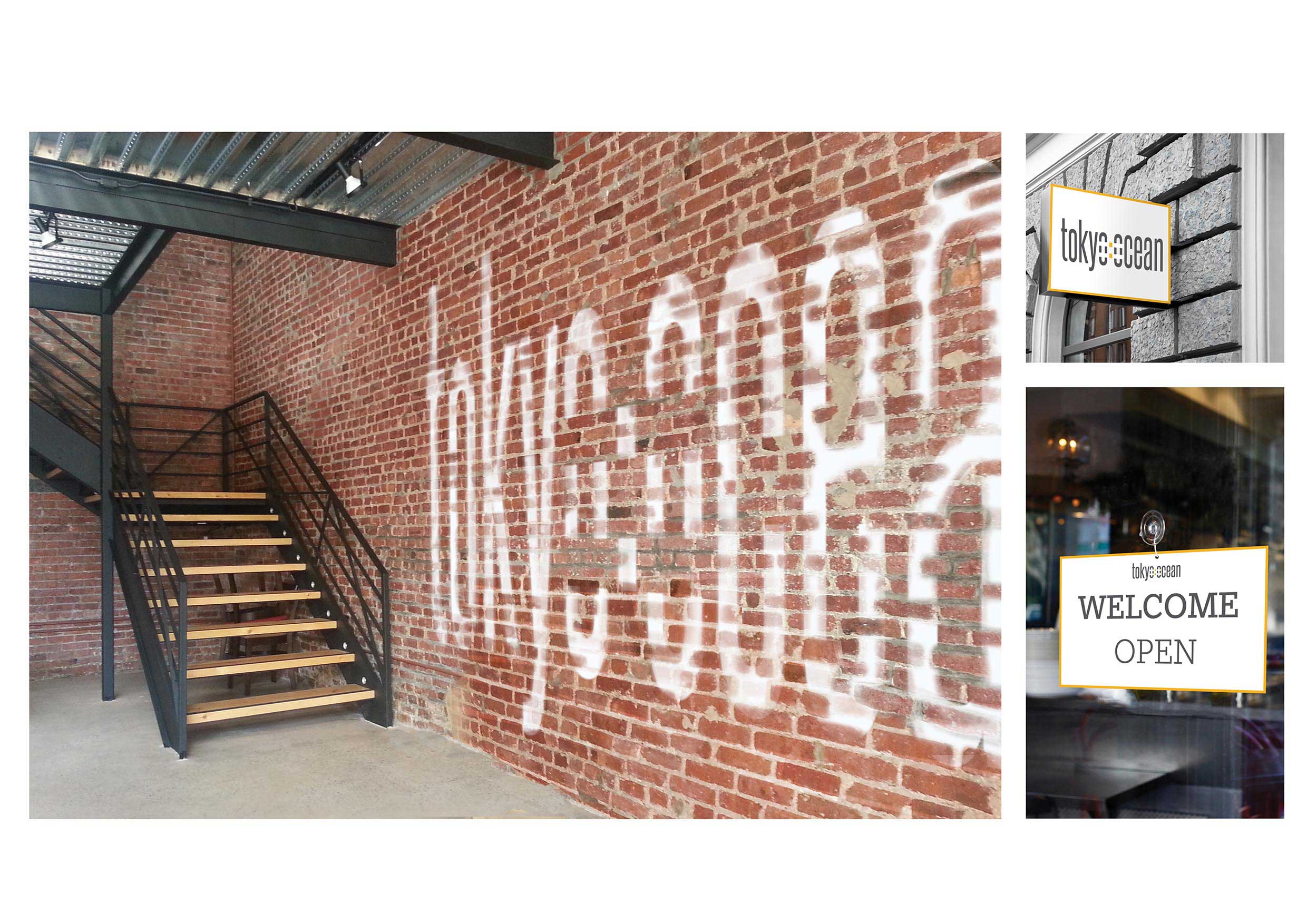
After I had designed the look of the stationary, I turned my imagination to how the interior or tokyo:ocean would appear, we were told that it was a old shoe factory located in Charlotte Street, Hoxton, so I was picturing a mix of modern/industrial, I had a lot of fun creating this ‘ghost sign’ of their logo for the interior of the building. I kept to my colour scheme of dark grey and yellow, and font choice, creating a strong brand feel.
 From here, I designed how the Baristas uniform may look, also the menus.
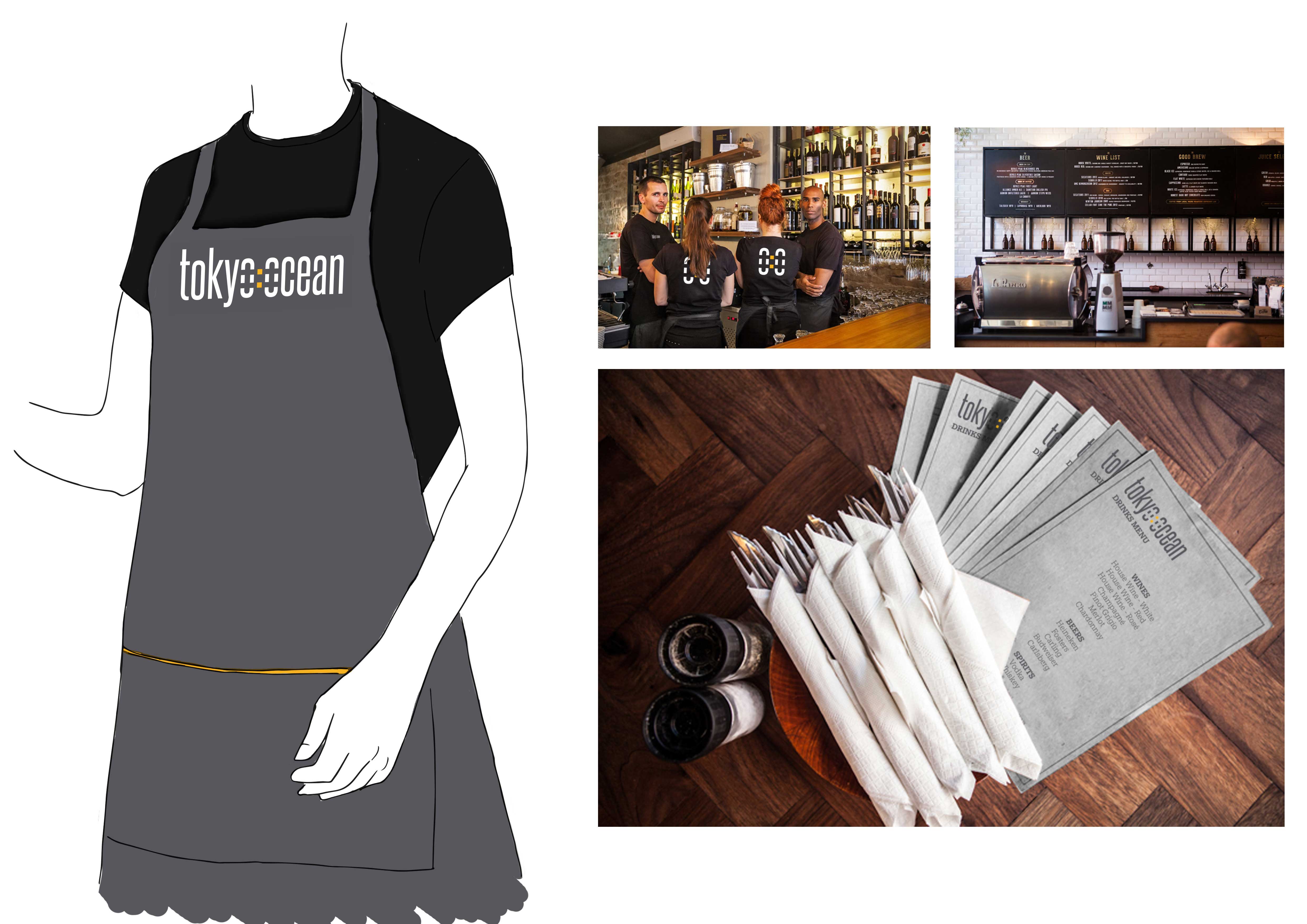
 I think the favicon and stamp patterns work really well for the coffee cups!

Leave a comment